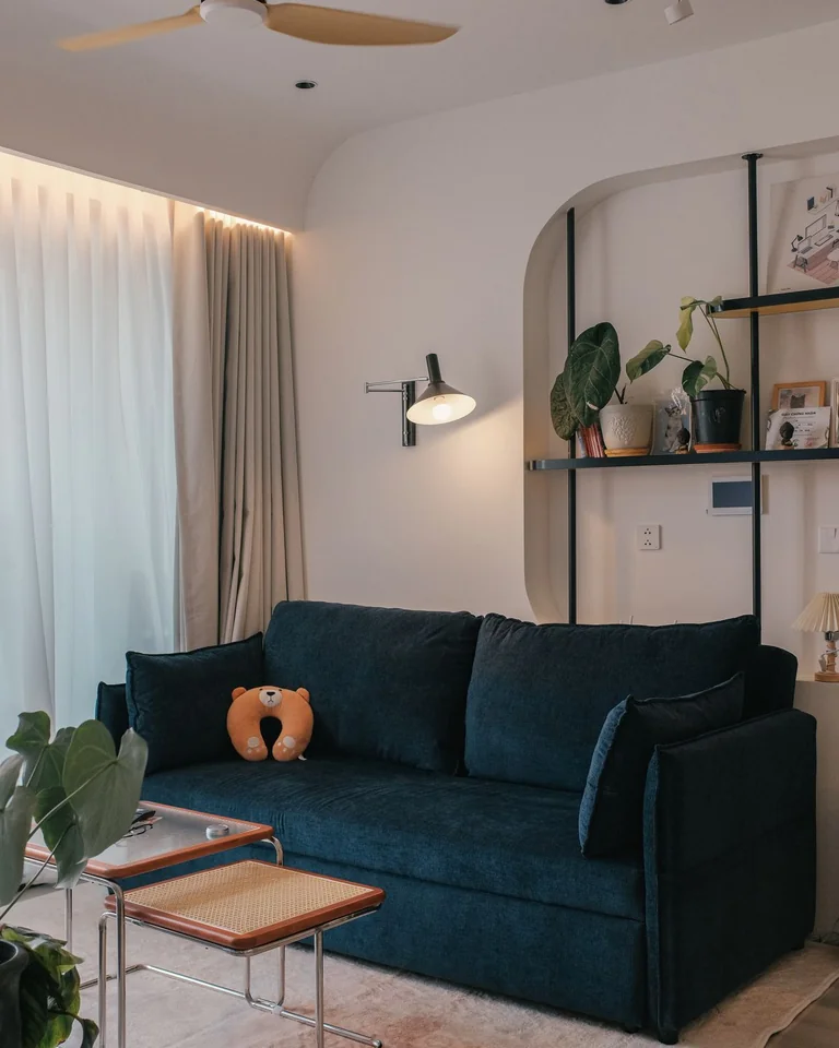
Wall Decor Above Couch: 17 Ideas That Actually Work (Plus Sizing Rules)
The wall above your couch is the single most visible surface in most living rooms, and it’s the one people get wrong most often. The fix isn’t better taste — it’s two measurements. Whatever you hang should span roughly two-thirds the width of your sofa (for an 84-inch sofa, that’s about 55–60 inches of art or arrangement), and its bottom edge should sit 6 to 10 inches above the back of the couch. Get those right and nearly any of the ideas below will look intentional.
With sizing settled, the real question is what to put there. Below are 17 genuinely different ways to style the wall above a couch, from one-and-done statement pieces to renter-friendly options that need zero nails.
Size It Right Before You Buy Anything
Designers repeat the two-thirds rule because it’s the one rule that fixes the most common mistake: art that’s too small. A piece that looks generous in the store reads like a postage stamp once it’s centered over a wide sofa. Multiply your sofa’s width by 0.65 and buy or arrange to that number — and go a size bigger than your instinct says.
Height matters just as much. Hang art so the center sits around 57–60 inches from the floor, which usually means the bottom edge lands 6–10 inches above the sofa back. Too high and the art visually detaches from the furniture, floating toward the ceiling like a stranger. Close together, couch and art read as one composed unit.
The zero-cost test: cut kraft paper or newspaper to your planned size, tape it to the wall with painter’s tape, and live with it for a day. You’ll know instantly whether the scale works — and you haven’t touched a nail.
One Oversized Statement Canvas
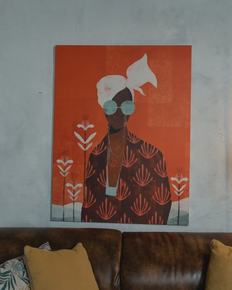
The simplest high-impact move: one large piece, centered, done. A single oversized canvas — 40 by 60 inches or larger — solves the proportion problem in a single purchase and asks nothing of you beyond one level hanging job. It works because scale is what the eye reads as “designed,” not cleverness.
Choose an image with enough visual weight to hold the wall: a bold abstract, a dramatic landscape, or a high-contrast photograph. Tip: unframed gallery-wrapped canvases read modern and skip the framing cost entirely.
A Collected Gallery Wall
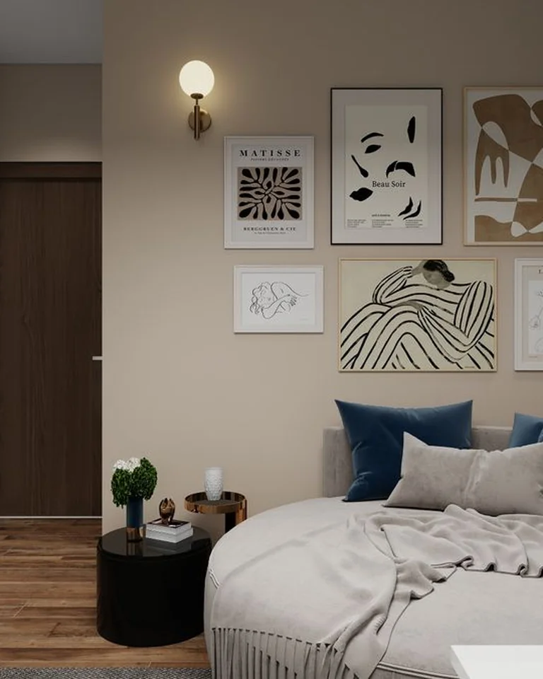
A gallery wall mixes prints, photographs, small mirrors, and even objects into one composed cluster. It’s the best option if you already own art you love but none of it is big enough to stand alone — together, the pieces add up to the required two-thirds width.
Keep it cohesive with one unifying thread: matching frames, a consistent color palette, or a single theme like travel photography. Plan the layout on the floor first, keep 2–3 inches between frames, and treat the whole cluster as one unit when you measure width. Tip: start with the largest piece slightly off-center and build outward — perfect symmetry isn’t the goal here.
A Tidy Grid of Matching Frames
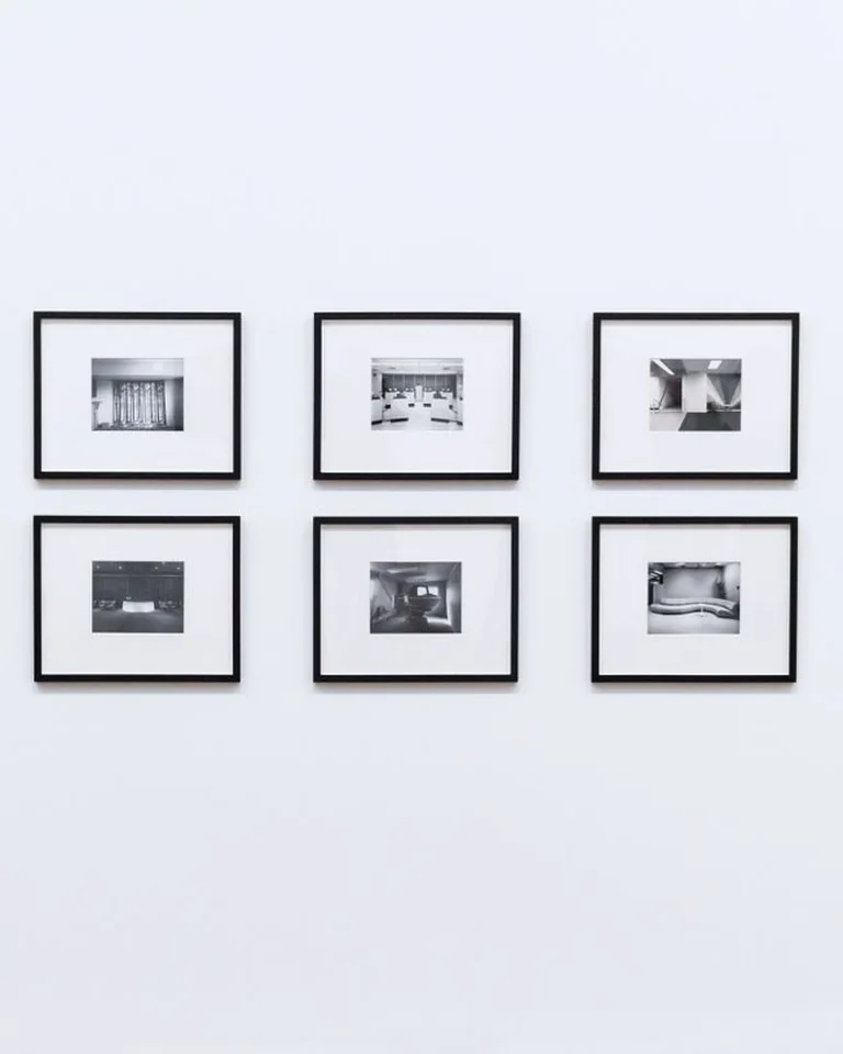
If a freeform gallery wall feels chaotic to you, go grid: four, six, or nine identical frames in even rows, same frame, same mat, 2–3 inches apart. Symmetry does the design thinking for you, which is why this is the most forgiving arrangement for beginners.
Black-and-white photography or a series of botanical prints both work beautifully in a grid because the uniformity of the content matches the uniformity of the layout. Tip: measure and mark your grid on the wall with painter’s tape before hanging — one crooked frame breaks the whole effect.
One Large Round Mirror
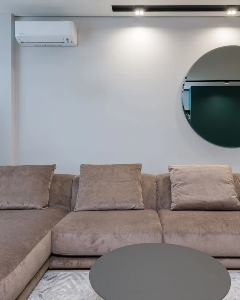
Choosing art means having opinions about art. A big mirror skips that entirely: it fills the wall, bounces light around the room, and makes the space feel larger, with no color decisions to agonize over. Round mirrors soften the boxy lines of a sofa better than rectangular ones.
Scale still applies — aim for a mirror roughly two-thirds the sofa’s width. Tip: hang it so it reflects something worth doubling: a window, a plant, or the prettiest corner of the room, not a blank wall or the TV.
A Pair of Matching Prints
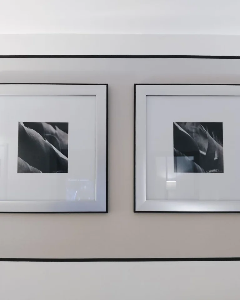
Two coordinated pieces side by side are the sweet spot between one statement piece and a full gallery wall. Keep them the same size, hang them 2–3 inches apart, and center the pair as a single unit over the sofa. The symmetry feels calm and deliberate, which suits traditional and transitional rooms especially well.
Diptychs, matching botanical studies, or two halves of one photograph all work. Tip: this is the easiest arrangement to shop for — many print shops sell curated pairs sized for exactly this spot.
A Three-Piece Triptych
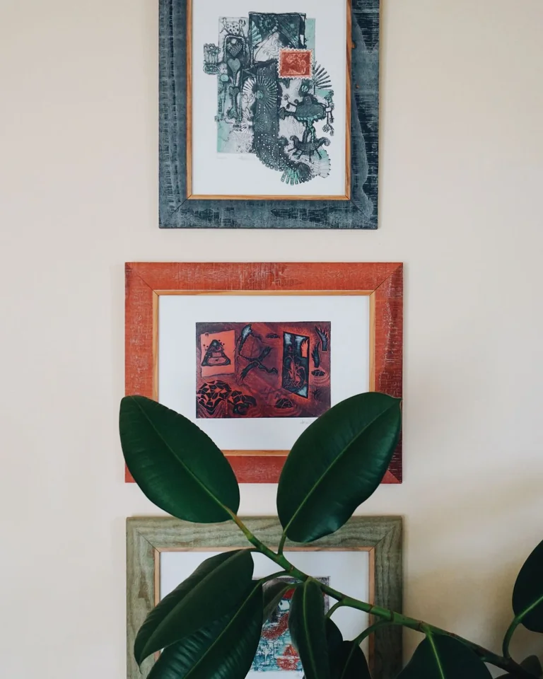
A triptych — one image split across three panels, or three related pieces in a row — adds rhythm and easily fills a wide wall without the fuss of a scattered gallery. The horizontal format naturally echoes the sofa’s shape, which is why it looks so settled above long sectionals.
Keep the tops aligned and spacing even (2–3 inches). Tip: panoramic landscapes and abstract color fields make the best triptychs, because the eye reads the three panels as one continuous scene.
A Picture Ledge With Layered Frames
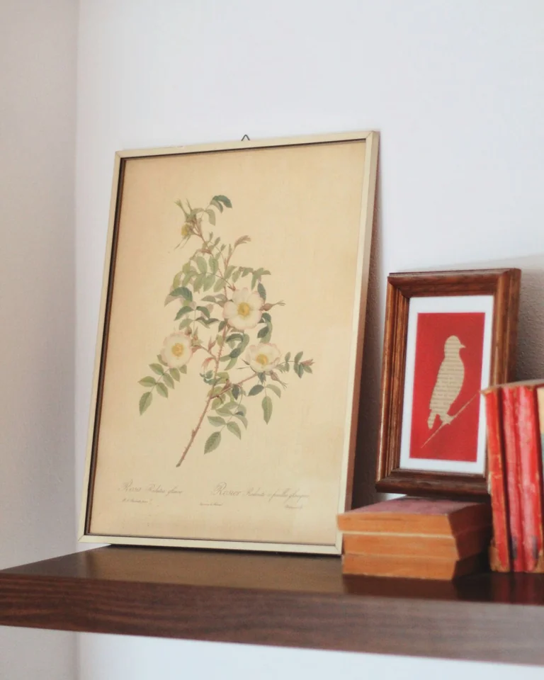
If committing to nail holes stresses you out, don’t commit. A narrow picture ledge lets you lean framed prints against the wall and rearrange them in seconds. Layer a large piece behind a smaller one, add a small trailing plant or candle at one end, and the shelf looks styled without a single permanent decision.
A 48-inch ledge suits most standard sofas; longer couches can take two ledges side by side. Tip: overlap frames front-to-back for depth, and keep the tallest piece in back so nothing hides.
Floating Shelves, Styled Sparely
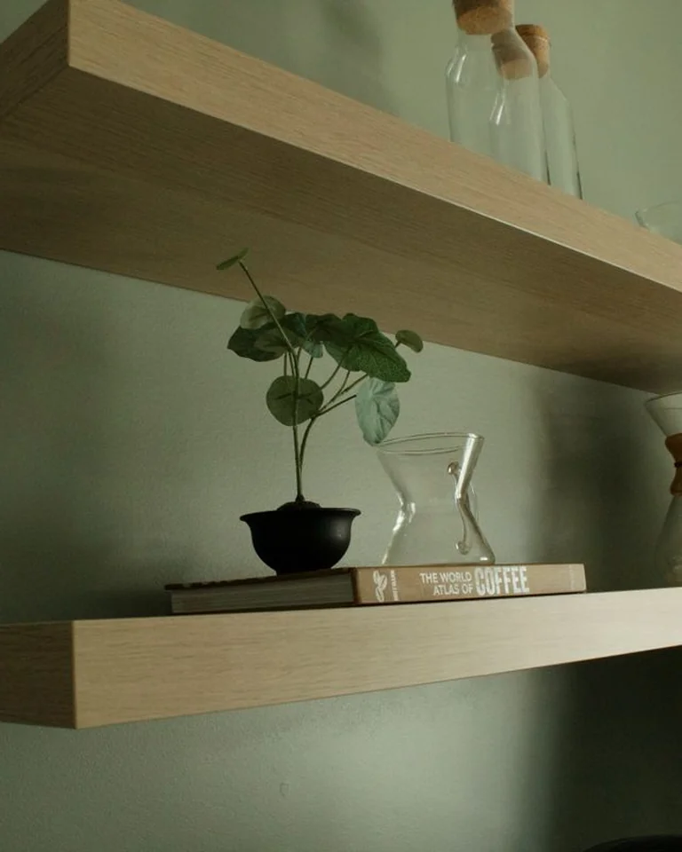
Two floating shelves above the couch give you storage that reads as decor — books, a trailing pothos, a sculptural vase. The trick is restraint: small objects on a big wall recreate the postage-stamp problem, multiplied. Three large items beat twelve small ones every time.
Style in odd numbers and vary heights, mixing one tall item (a vase, a stack of books) with lower ones. Tip: mount the lower shelf about 12–18 inches above the sofa back so nobody knocks things over standing up — and skip dusty knick-knacks directly above where you sit.
A Honeycomb of Hexagon Shelves

Hexagon shelves clustered together give you display space that reads as geometric art. Mix a few hexagons with one straight horizontal shelf to break up the pattern, and style with books stacked both ways plus a couple of sculptural vases.
This works best in modern and Scandinavian rooms where the geometry feels at home. Tip: trace each shelf on kraft paper first and tape the cluster to the wall — honeycomb layouts are easy to misjudge and hard to re-hang.
A Woven Basket Wall
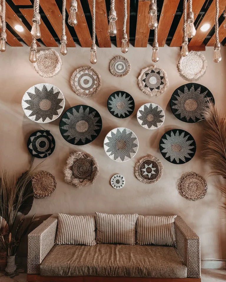
A cluster of flat woven baskets turns a blank wall into texture. Vary the sizes, keep a loose palette of natural tones, and arrange in an asymmetrical cluster with odd numbers — it reads organic rather than rigid.
This is a genuinely budget-friendly option, and it suits boho, coastal, and farmhouse rooms. Tip: baskets are light, so small nails or even adhesive hooks usually hold them — a good pick for renters.
A Macramé or Woven Textile Hanging

Textile wall decor brings softness that framed art can’t. A large macramé hanging or woven wall piece adds dimension and warmth, especially welcome in minimalist rooms where everything else is hard-edged. Go big — a small textile gets lost exactly like a small frame does.
Natural fibers (cotton, jute, wool) pair well with wood furniture and plants. Tip: hang textiles from a wooden dowel or branch for a finished look, and keep them out of direct sun to prevent fading.
A Bold Tapestry
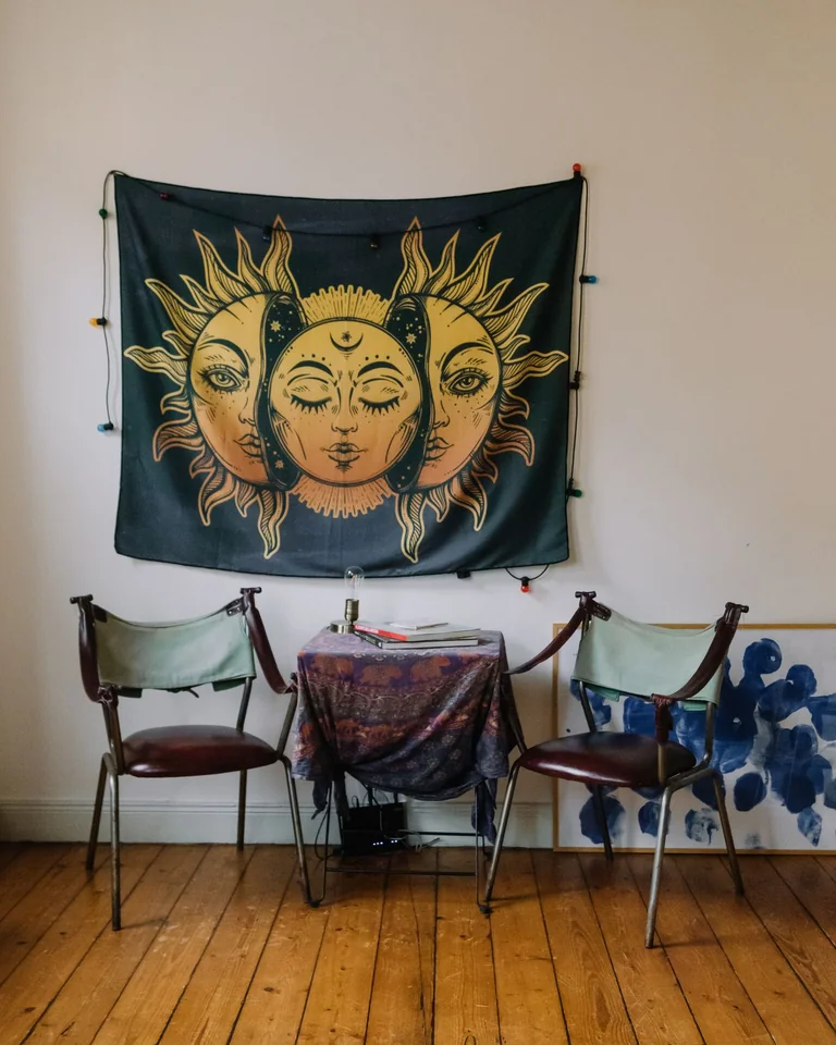
A tapestry covers more wall per dollar than almost anything else, which makes it the fastest fix for a big blank expanse. It also adds pattern and color in one move — useful if your sofa and walls are both neutral and the room feels flat.
Stretch it on a frame or hang it from a rod so it lies flat; a sagging tapestry reads sloppy. Tip: pick up one color from the tapestry in a cushion or throw to tie it to the rest of the room.
An Oversized Wall Clock
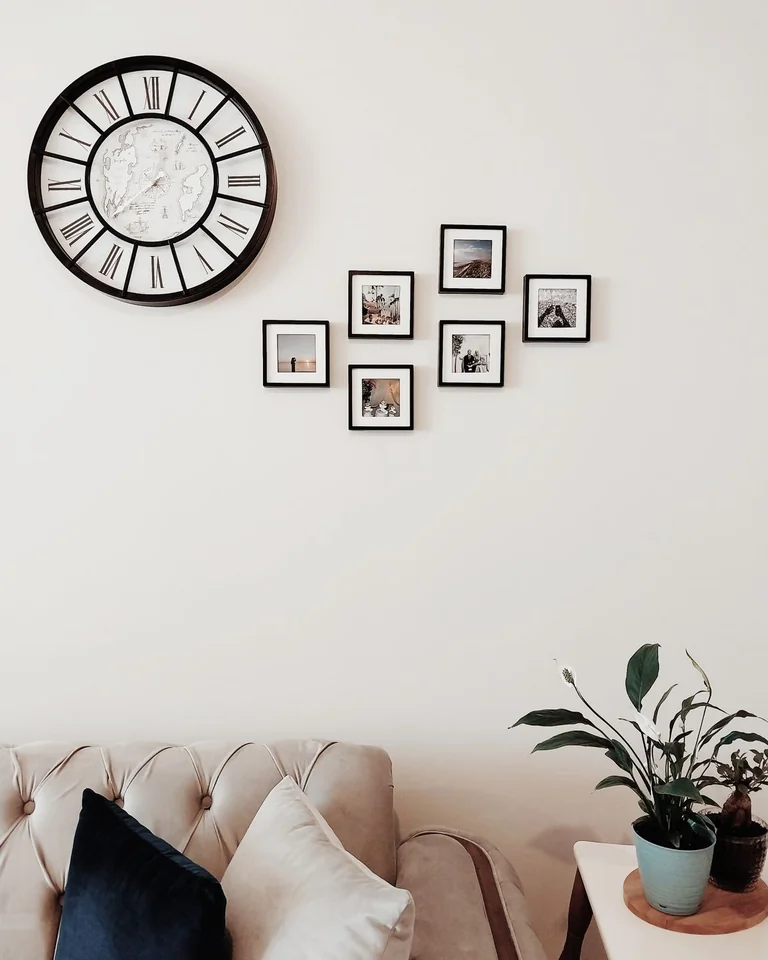
A clock sounds too practical to count as decor, but a sculptural one solves two problems: the wall gets a focal point and the room gets a working clock where you’ll actually see it. Sunburst and oversized farmhouse styles both work because they’re essentially sculpture that happens to tell time.
Keep the rest of the wall quiet so the clock has room to breathe — it needs negative space around it. Tip: size up aggressively; a clock under 24 inches wide will look lost above a full-size sofa.
Wall Sconces That Frame the Art
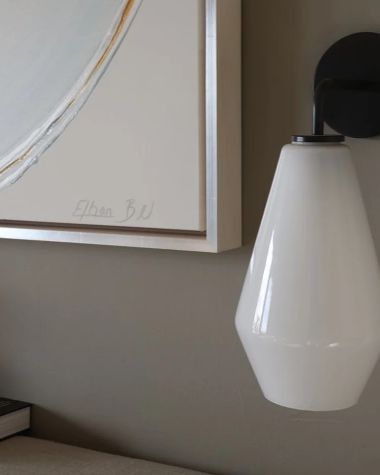
A pair of sconces flanking a central piece of art does double duty: lighting and framing. They draw the eye inward, add warm evening light exactly where you read or talk, and make even a modest print feel like a gallery installation.
Hardwired sconces need an electrician, but plug-in and battery-operated versions now look genuinely good. Tip: mount them so the light source sits around 60–66 inches from the floor, roughly at the art’s vertical center.
An Abstract in Your Room’s Colors
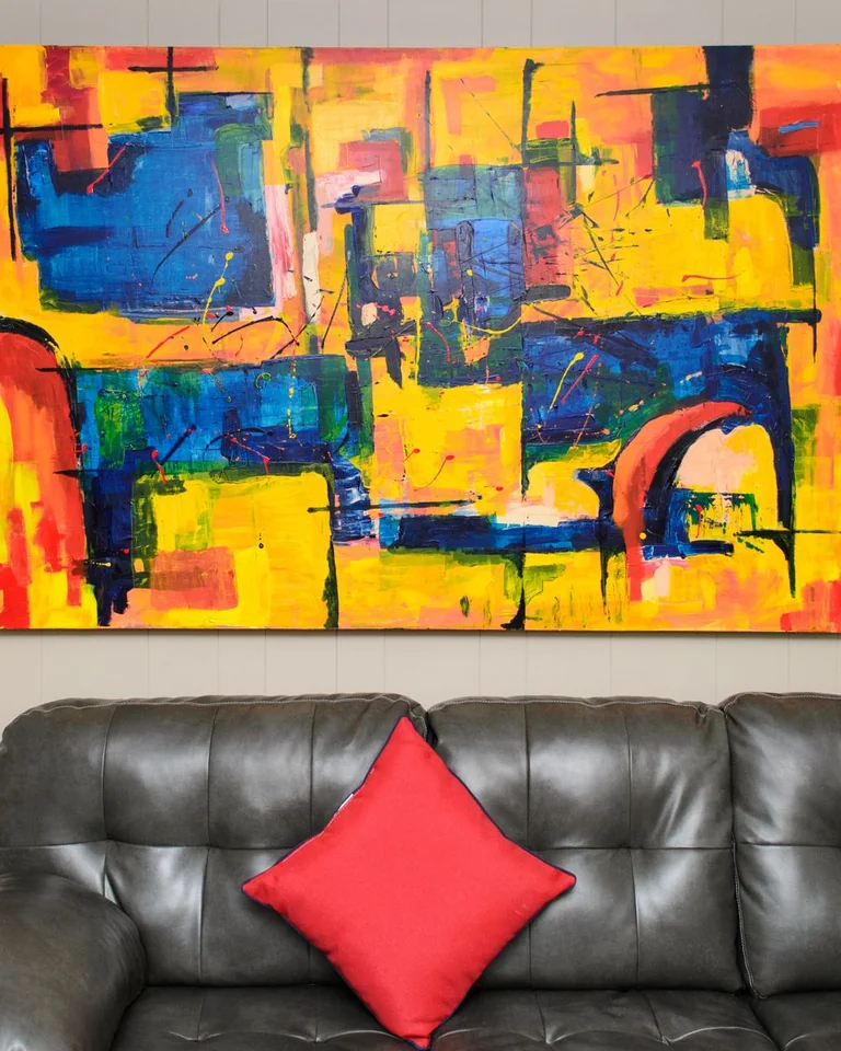
Abstract art is the easy-mode choice above a couch: it adds color and movement without competing with your furniture, and it works in nearly any style. The trick to making it look chosen rather than random is pulling one or two colors from your cushions or rug into the piece.
Large-scale abstracts have the most impact, but a set of two or three smaller coordinated abstracts works too. Tip: match the frame to something already in the room — black frames if your coffee table legs are black, warm wood if your floor is warm wood.
Botanical or Landscape Prints
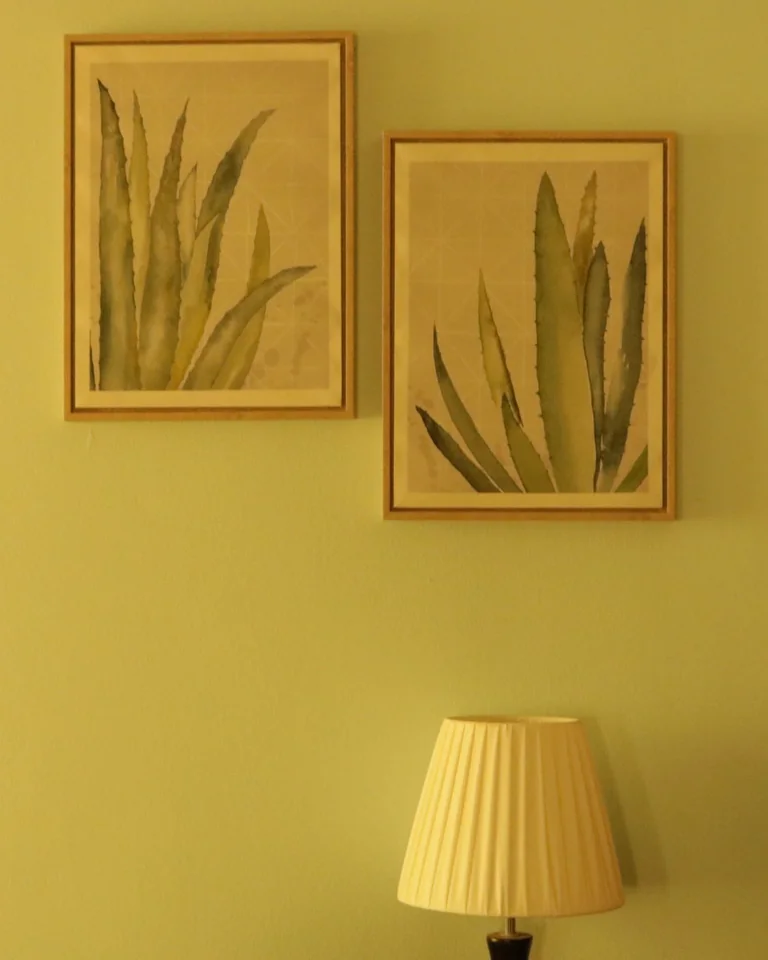
Nature scenes — botanical studies, misty landscapes, ocean horizons — act like a window, making the living room feel larger and calmer. They’re the safest choice for resale-conscious decorators and the easiest to live with long-term, since they never shout.
A series of matching botanical prints in identical frames is a classic for a reason. Tip: green tones in the art echo houseplants elsewhere in the room, which quietly ties the whole space together.
Your Own Photos, Printed Large
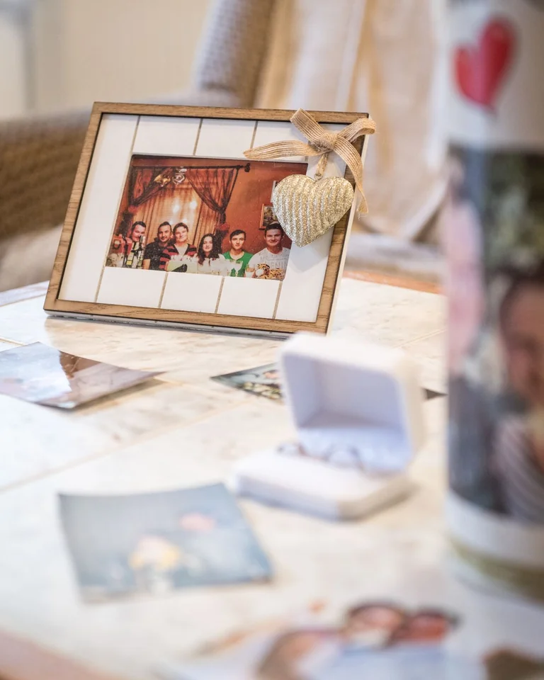
A favorite travel shot or family photo printed large is the one thing above your couch that no one else can replicate. Small prints get lost — go 20 by 30 inches minimum, or build a tight cluster of same-size prints that hits the two-thirds width together.
Black-and-white conversions unify mismatched photos instantly. Tip: use the same frame and mat for every photo in the cluster; consistency is what makes personal photos look like decor instead of a bulletin board.
Hang It Like a Pro: The Paper Template Trick

The single best trick for anyone who doesn’t trust their eye costs nothing: cut newspaper or kraft paper to the exact size of each frame, tape the shapes to the wall with painter’s tape, and move them around. Live with the layout for a day. When it looks right, drive your nails straight through the paper, then tear it away.
You get to make all your mistakes in tape instead of nail holes. Other pro habits: use two hooks for wide pieces so they don’t tilt, keep a small level in your hanging kit, and measure twice from the floor — eyeballing height is how art ends up crooked or too high.
Mistakes That Ruin the Whole Wall
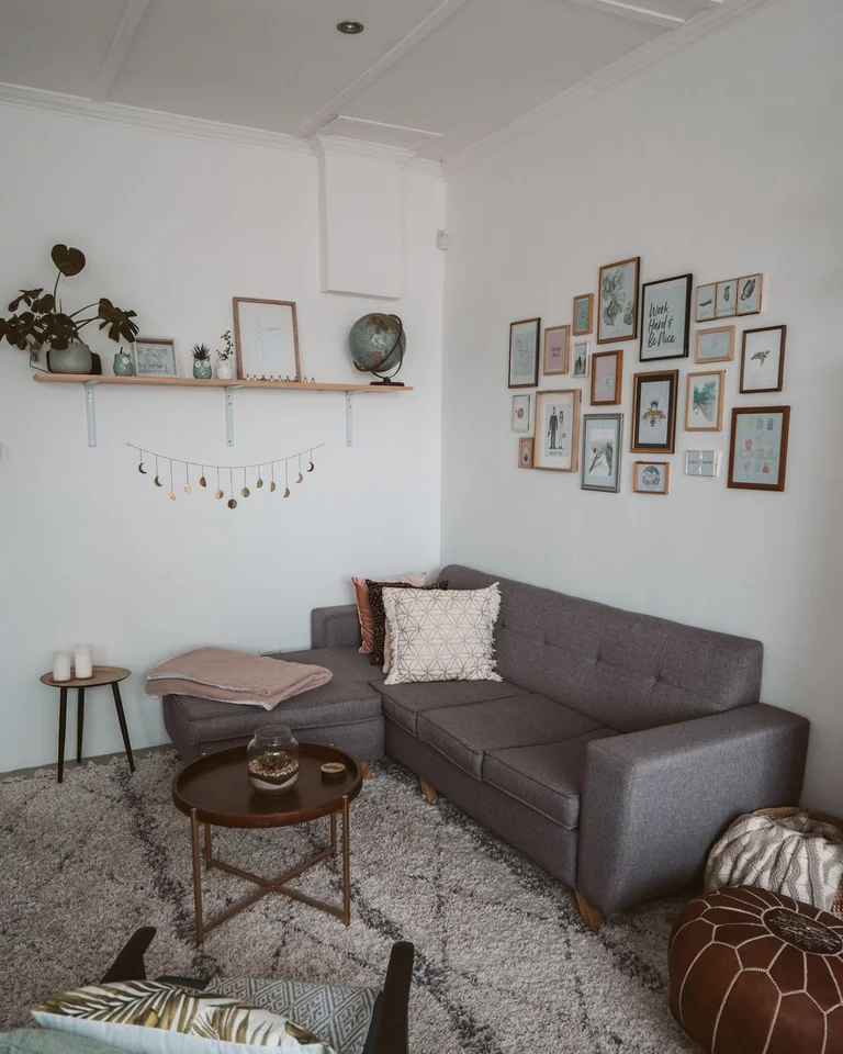
Three errors account for most disappointing sofa walls. Too small is the runaway winner — if you’re debating between two sizes, take the bigger one. Too high is second: art hung at standing eye level above a low sofa floats disconnected; the 6–10-inch gap rule exists to prevent exactly this.
Third is clutter without scale: a dozen tiny objects scattered across a big wall reads as mess, not curation. Every arrangement needs one dominant element — a large piece, a tight cluster, or a bold shape — that the eye lands on first. Fix the dominant element and the supporting pieces fall into place.
Frequently Asked Questions
How big should wall art be above a couch?
Aim for the art or arrangement to span about two-thirds the width of the sofa. For a standard 84-inch sofa, that’s roughly 55–60 inches across. If you’re hanging multiple pieces, measure the whole group as one unit.
How high should I hang pictures above a sofa?
The bottom edge of the frame should sit 6–10 inches above the top of the sofa back, with the center of the piece around 57–60 inches from the floor. Hanging higher makes the art look disconnected from the furniture.
Should the art be centered over the couch?
Usually, yes — centered is the safest and most balanced choice. The exception is a deliberate off-center gallery wall or an asymmetrical arrangement, which should look clearly intentional, not like a measuring error.
Can I hang a mirror above a couch instead of art?
Absolutely. A large mirror fills the wall, reflects light, and makes the room feel bigger. Just make sure it’s scaled like art (two-thirds the sofa width) and positioned to reflect something attractive, like a window or plants.